 SIM
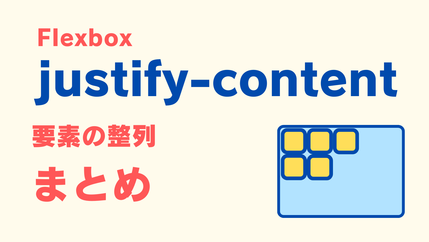
SIMこんにちは、SIMです。今回は要素の整列で使用頻度の高いflexboxのjustify-contentの使い方をまとめました。
はじめに|flexboxの設定など
SIM最初に今回使うflexboxの構造をザックリと紹介します。
ここでは、ピンク色のエリア内に黄色のボックスを並べた例で説明していきます。
なお、flexboxは整列対象のボックス(黄色)の親要素(ピンク色)に対して使います(下のCodePen参照)。
See the Pen Box間の余白を均等に配置:justify-content: space-evenly; by Satoru Shimizu (@sat-simizu) on CodePen.
justify-content: flex-start;|左寄せと上寄せ
左寄せ|flex-direction: row;(デフォルト設定)で横並びの場合
SIMまずは横並びで左寄せパターンから紹介します。この場合はjustify-content: flex-start;を使います。
下記が左寄せのCSS(抜粋)です。詳しくはその下のCodePenをご覧ください。
<!-- ボックス全体の囲い -->
<ul class="flex-wrapper">
 <!-- 各ボックス -->
 <li class="flex-content">A</li>
 <li class="flex-content">B</li>
 <li class="flex-content">C</li>
</ul>
/* ---------------------- */
/* 各ボックスの親 */
/* ---------------------- */
.flex-wrapper{
display: flex;
justify-content: flex-start;
}See the Pen Untitled by Satoru Shimizu (@sat-simizu) on CodePen.
上寄せ|flex-direction: column;で縦並びの場合
SIM縦並びで上寄せパターンの場合もjustify-content: flex-start;を使います。
/* ---------------------- */
/* 各ボックスの親 */
/* ---------------------- */
.flex-wrapper{
  display: flex;
  flex-direction: column;
  justify-content: flex-start;
}
See the Pen Untitled by Satoru Shimizu (@sat-simizu) on CodePen.
justify-content: flex-end;|右寄せと下寄せ
右寄せ|flex-direction: row;(デフォルト設定)で横並びの場合
SIM次は、右寄せパターン。実際の表示はCodePenをご覧ください。
HTMLは上のと共通です。これ以降もすべてHTML共通ですので省略します。
/* ---------------------- */
/* 各ボックスの親 */
/* ---------------------- */
.flex-wrapper{
  display: flex;
  justify-content: flex-end;
}
See the Pen 右寄せ|justify-content: flex-end; by Satoru Shimizu (@sat-simizu) on CodePen.
下寄せ|flex-direction: column;で縦並びの場合
SIM縦並びの場合、justify-content: flex-end;は下寄せに変わります。
/* ---------------------- */
/* 各ボックスの親 */
/* ---------------------- */
.flex-wrapper{
  display: flex;
  flex-direction: column;
  justify-content: flex-end;
}
See the Pen 上寄せ|justify-content: flex-end; 縦並び by Satoru Shimizu (@sat-simizu) on CodePen.
中央寄せ|justify-content: center;
左右中央寄せ|flex-direction: row;(デフォルト設定)で横並びの場合
SIM左右中央寄せです。
/* ---------------------- */
/* 各ボックスの親 */
/* ---------------------- */
.flex-wrapper{
  display: flex;
  justify-content: center;
}
See the Pen 中央寄せ|justify-content: center; by Satoru Shimizu (@sat-simizu) on CodePen.
上下中央寄せ|flex-direction: column;で縦並びの場合
SIM縦並びの場合、上下中央寄せでjustify-content: center;を使います。align-items: center;と混同しやすいから気をつけて下さい。
/* ---------------------- */
/* ボックス全体の囲い */
/* ---------------------- */
.flex-wrapper{
  display: flex;
  justify-content: center;
  flex-direction: column;
}
See the Pen 上下中央寄せ|justify-content: center; 縦並び by Satoru Shimizu (@sat-simizu) on CodePen.
SIMここでalign-items: center;を併用すると、上下左右中央寄せの配置になります。
両端揃え|justify-content: space-between;
flex-direction: row;で横並び(初期設定の場合)、justify-content: space-between;で両端揃えになります。
両端揃えの表示とコードは下記CodePenでご確認下さい。
/* ---------------------- */
/* 各ボックスの親 */
/* ---------------------- */
.flex-wrapper{
  display: flex;
  justify-content: space-between;
}
See the Pen 両端揃え|justify-content: space-between; by Satoru Shimizu (@sat-simizu) on CodePen.
Box両端の余白を均等に配置|justify-content: space-around;
SIM次は並べる各ボックス両端の余白を同じにして配列するパターン。CodePenで表示をご確認下さい。
/* ---------------------- */
/* 各ボックスの親 */
/* ---------------------- */
.flex-wrapper{
  display: flex;
  justify-content: space-around;
}
See the Pen Box両端の余白を均等に配置:justify-content: space-around; by Satoru Shimizu (@sat-simizu) on CodePen.
Box間の余白を均等に配置|justify-content: space-evenly;
SIM最後は、ボックス間あるいはボックス横の余白を均等に配置したパターン。これも言葉では分かりにくいのでCodePenで確認してみてね。
/* ---------------------- */
/* 各ボックスの親 */
/* ---------------------- */
.flex-wrapper{
  display: flex;
  justify-content: space-evenly;
}
See the Pen Box間の余白を均等に配置:justify-content: space-evenly; by Satoru Shimizu (@sat-simizu) on CodePen.
SIMspace-aroundとspace-evenlyの違いが分かりにくいと思いますが、注意して見るとspace-evenlyの方はすべての余白が同じ幅になっているのが分かります。
まとめ
SIM以上、flexboxでjustify-contentの使い方を紹介しました。横並びと縦並びで挙動が少し違うので慣れるまで混乱するかもしれませんね。
私も未だに「あれ?どうだったっけ?」とグーグル先生に質問する時がありますので、この記事がそんな方達のお役に立てば幸いです。


